

Redesign UPS Mobile™ App iOS Tracking Flow
OVERVIEW
UPS Mobile App has multiple features that help customers to track their packages delivery status, find a UPS location, obtain shipping rate and transit quote.
Duration: 7 days
Role: Product designer
Tool: Sketch, Principle, AE, Photoshop
.png)
_p.png)
Operational Transparent?
UPS tracking system is not transparent. Customers do not know when exactly the package will arrive. Companies like UBER have changed the customer expectations, providing a transparent view of a driver's location, contact details, etc. UPS did not provide high-quality service that annoys users to be waiting for delivery, or sometimes lost packages due to be stolen by thieves. Users start filing complaints, arguing with customer representatives that raises more conflicts between the two sides. The consequence is that UPS receive poor ratings from the public eye.
OVERALL UPS SHIPPING EXPERIENCE


MOBILE APP TRACKING FLOW App - REDESIGN FOCUS
RESEARCH
Based on the current user experience, thus further understand the pain points between users and UPS deliverymen, I conduct two different approaches to research.


Based on the user research with supporting data, I generate the Affinity Diagram to map out the insights, pain points from multiple users perspectives and different context. Composing a User Journey Map helps to define users’ pain points and aha moments experiences from beginning to end. Utilizing the Emotional Experience chart creates a clear view of understanding the positive and negative experience of users. After completing these exercises, I create an idea of what UPS need to improve to solve those problems. Based on the existing tracking flow, I redesign and optimize the tracking process, creating a wireframe and mock-up to illustrate how the process can improve the overall user experience on the UPS Mobile app.
IDEATION
DESIGN PROCESS
.png)

AFFINITY DIAGRAM
After finishing the affinity diagram, I have a better understanding of what this flow problem should approach and spent some time to sort and re-organize all the information back and forth finally, and I got an overview of the user flow.
USER JOURNEY
UPS expect the job is completed once the package is marked as "delivered" in their system, but in a real case, the packages may or may not be in the recipients‘ hands yet. The user usually has the most significant emotional swings after "delivered" stage because either the packages are physically in their hands, or it is sitting at the front door that poses significant risks to be stolen from thieves.
.png)
Goal & Expectation
-
She expects the package would be delivered on time.
-
She does not need to worry about shipment delay nor missing package after delivery.
-
She can locate where her package at.
-
Her travel plan would not be affected thus she could travel on next Monday.


Why customers have such big emotional swings after the “delivered” stage?
Since a user is worried about the risk of the package sitting at the door that exposed to thieves. If the package is stolen after “Delivered”, a user will be angry, upset and frustrated to UPS poor delivery service. The user will need to call in customer care to follow up.
REDESIGN OVERVIEW
In UPS mobile app tracking flow, I focus on redesigning user journey to improve the interaction experience.
.png)

WIREFRAME
Based on the research analysis, user journey and insight, I combined them into a wireframe and sketched a few different flow paths embedded with new desired features and significant components. At last two of the most stand out concepts are chosen to display below.


CONCEPT-LIST VIEW
CONCEPT-CARD VIEW
LOW FIDELITY PROTOTYPE
I hand-sketched a set of a quick paper prototype with two different concepts – Slide or List view for user testing. After getting several user feedback, I decided to choose List view as User Interaction Design.
Why do I choose List View?
-
Advantages over Slide view as it captures/covers most of the features more quickly.
-
Succinct and clear view.
-
User Interface is more simple compared to slide view.
-
On Tracking Package page, it displays more information compare to Slide view.


VISUAL DESIGN

Design based on user's perspective to find the solutions - to enhance user experience as being more transparent on package tracking flow.


Enhance user experience with a new design - based on the user’s perspective to encourage users to have total control on the shipping journey path instead of being passive to wait for the package.


.png)

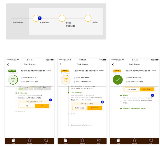
Regarding the improvement for tracking flow, a redesign to extend the delivery service beyond the current process is established.
The new design concept, with three new elements (Received, Lost Package and Claim) are implemented to go beyond and continue to track the delivery route to ensure users receive the packages. If the packages are lost or stolen, users can immediately file for lost package claim process.


PROTOTYPE

ORDER PROCESSED READY

DELAY PACKAGE

PACKAGE DELIVERY
USER TESTING
Because of the time constraint, I did not have enough time to conduct tests for my design. I chose to quickly sketch the prototypes and ask my friends to collect some feedback. One important feedback I received was that the tracking process and user flow had improved but not optimized to the best way that can satisfy all testers. There is always room for improvement as practice and iteration can make perfect.
If there is a chance I would like to conduct more user testing, collect more data to analyze that may lead to new design insights, redesign new wireframes, prototypes, iteration and so on.
CONCLUSION
I spent lots of time to research and understand what the gaps in current tracking flow are. Based on user context, data from user research for analysis, I could be able to find the pain points that most users have experienced. Before jumping into design, it is essential to think from a user’s perspective first. I think beyond the current process to design a longer tracking flow that includes “received and confirm” status, follow with package lost claim process. Finally, users can have access to file an incident report and receive updates on the mobile app. All these additional features extend the tracking flow for improvement on user experience.