News Break
News Break -
A Personalize news app
Mobile iOS App design
Installs: 10,000,000+
OVERVIEW
NewsBreak is a content aggregation app. It focuses on giving users greater experience through mobile app personalization. Depends on users' interests, NewsBreak delivers the most relevant content at any time.
How does a content app work?

What are our goals?

-
We want to solve the problem of information overload and achieve a personalized contents app.
-
Product perspective: engaging, trusted, and smart.
-
Help users select contents they are interested in and give users an enjoyable reading experience.
TIMELINE FOR ITERATION

DEFINITION

Enjoyable -
Make you feel happy
-
Users interested in this topic;
-
An article shows quickly and clearly;
-
Users can interact with articles (save, like, share and comments);
-
Users can keep reading relevant topic if they want;
-
Users feel comfortable after they read for a long time.
LIMITATION
Copyright issue - Due to copyright issue against the content provider (CNN news, CNBC, etc.), any other content aggregation apps, if they don’t buy copyright, they will have to show a web view first when the user reads an article.
Do you remember...
What was the reading experience on mobile app back in 2015?

Many Ads


Many components
Longtime loading

No responsive design

Users feedback


We received lots of feedback from active users…
How to show an original website and improve an enjoyable reading experience?

BRAINSTORMING
After brainstorming, we summarized in 2 different directions to improve the reading experience.
-
Improve “Web View” experience.
-
Showing both “Web View” and “Quick View” at the same time.
Quick View: we have our own article view to improving the reading experience.
IDEATION
1.Improve web view experience

-
Web view has lots of limitation ( long loading time, and can’t control Ads, and components);
-
Web view always has one article, no relevant topics.
-
Lots of information distracts that causes users to feel uncomfortable.
.png)
2. Use two views - Improve user experience by building a “Quick View.”
-
Display quickly
-
No ads
-
Interactive design
-
Provide relevant articles underneath
STRUCTURE

PROBLEM
How to introduce “Quick View” with understanding the improved reading experience?

Wireframe
We proposed a few solutions on “Quick View.” We hope that users can understand Quick View through a simpler design.
Affordance:
“Quick View” should have visibility, let users know it has a better reading experience.
Signifiers:
Trying to use an arrow, flip, swipe up design elements, to trigger this feature.
Affordance:
Give users quick loading feedback on “Quick View” by displaying an article quickly.
SOLUTION 1


-
Button showing range-wide (Loading time) 0.2s - 4s
-
Users don’t understand the red button means
-
No motivation to tap the button
SOLUTION 2
.png)

-
Visually improved
-
Finger point signifiers users “Quick View” is ready.
-
Mapping the structure


Critical Thinking


Even we received much positive feedback from the A/B test, data and user’s feedback…
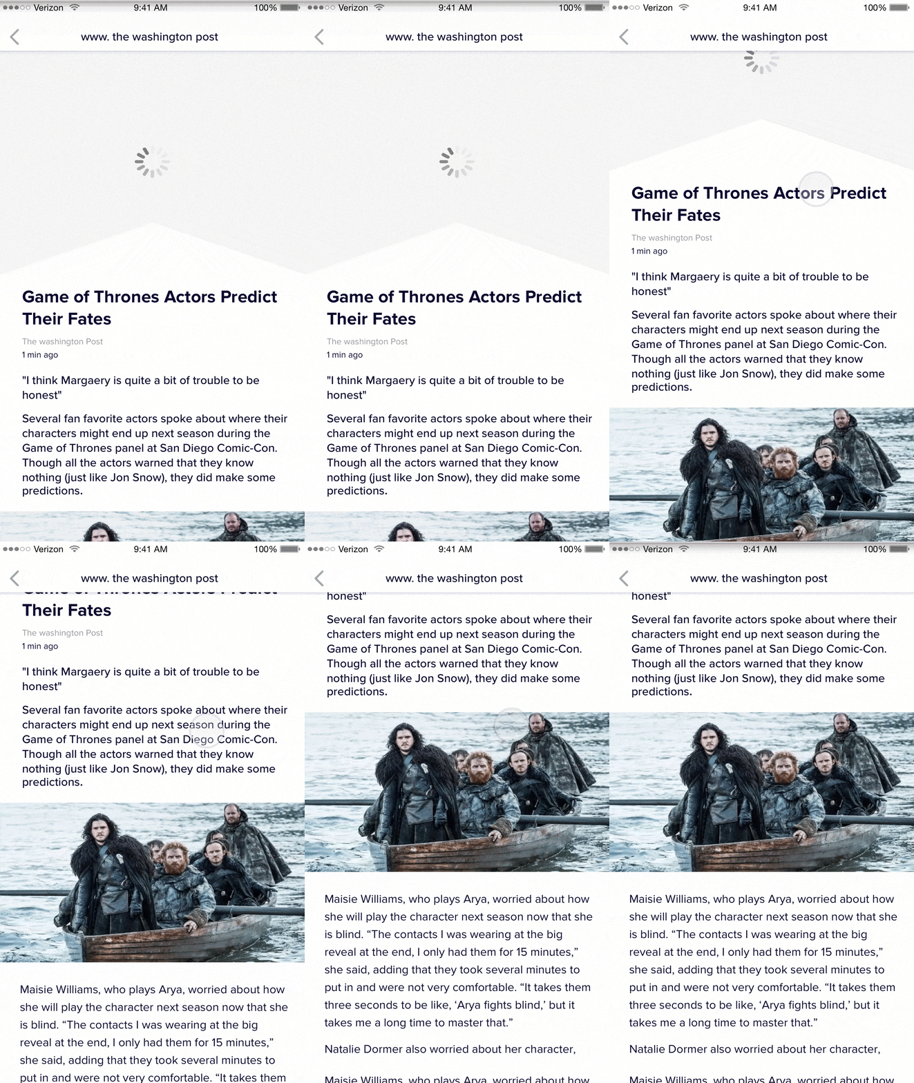
SOLUTION 3
-
After critical thinking, I proposed another solution:


-
A user won’t need to understand the difference between “Web View”&” Quick View.”
-
This design forces on “Affordance,” as users don’t need to learn but follow natural behavior to simplify this interaction.
-
Less confusion and tried to achieve the user’s mental model.
PROTOTYPE


MEASURE SUCCESS RATE
-
Users engaged, and we got much positive feedback from users.


CONCLUSION
Based on this product. I learned product thinking and critical thinking. I tried to think outside the box to be more creative. To be more organize and be able to prioritize to a different degree. I learned how to lead a team to work more efficiently, and realized communication is very important for team collaboration. If we have fire-drill issues, consider about time-limitation, I could respond quickly to define a critical process, analyze and find the right path and work as a team to solve the problem.
OTHER DESIGN
-
Users engaged, and we got much positive feedback from users.


